

Elder Folks
Age well, on your terms. Repositioning Aged Care Placement Services as Elder Folks, with a new brand built around dignity, choice and care.

Client
Elder Folks
Industry
Health
Year
2025
Services
Rebrand
Website
Campaign




The client
Elder Folks helps older Australians get the care, housing and support they need to live safely, independently and on their own terms.
Formerly known as Aged Care Placement Services, the organisation had spent more than a decade helping older people and their families navigate some of life’s harder transitions. But over time, the work had grown well beyond aged care placement.
Today, the team works across aged care navigation, housing stability and homelessness prevention, hoarding and squalor support, downsizing and relocation, and occupational therapy. One organisation, lots of moving parts, and a founder who’ll leave no stone unturned to get someone the support they need.
The brief
Aged Care Placement Services had outgrown its current branding. The name and positioning reflected one part of what the organisation did, but not the breadth of its services, the people behind them or the way they worked. As new programs had been added over the years, the brand architecture had evolved and needed a rethink, too.
The bigger challenge was what the old name signalled. “Aged care placement” sounds transactional. The reality was anything but.
The team was working alongside older Australians, families, carers, health professionals, housing providers and community organisations to navigate systems that can be confusing, fragmented and bloody hard to get through.
We were brought in to rethink the brand from the ground up, including strategy, naming, brand architecture, verbal identity, visual identity, rollout and a new website.
Our job was to create a brand broad enough for where the organisation had grown, clear enough for people already under stress to understand, and human enough to reflect the care and tenacity behind the work.
The impact
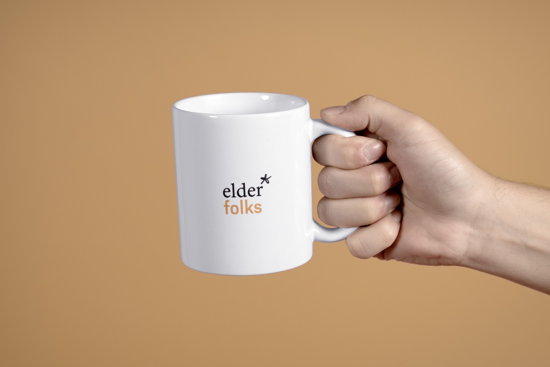
Aged Care Placement Services became Elder Folks: one brand capable of holding a much bigger ambition.
The team now has a clearer architecture for a growing range of services, a positioning built around dignity and choice, a verbal identity that makes complicated things easier to understand, and a visual system that looks nothing like the clinical category around it.
Most importantly, the brand feels much closer to the organisation behind it: caring, practical, persistent and prepared to keep going when the system gets hard.
A brand built to help more people age well, on their terms.
Related work

